
Styling with Intetion and Authenticity
There is no right way to show up, only an honest one.
1. My philosophy
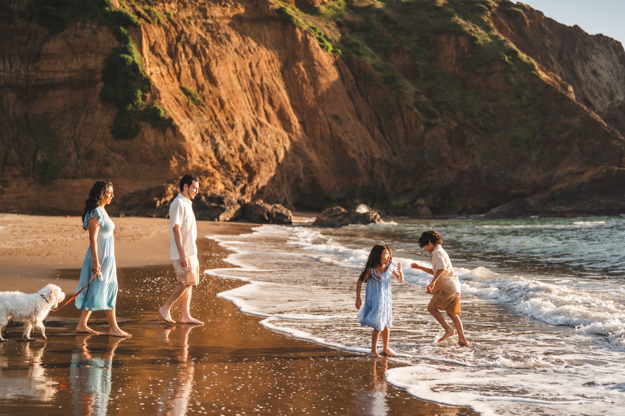
When it comes to what to wear for your session, the most important thing to me is that you feel like yourselves, whether you’re coming as a couple, a family, or somewhere in between.
I care far more about authenticity and intention than following a strict set of rules.
If you’re drawn to bold colors — wear them. If one partner, or one family member, prefers a standout look, that’s part of who you are in this moment.
My own daughter went through a phase where she wanted to wear her cow costume constantly, and I am so grateful I have photos of her in it. Those images don’t just show what she looked like. They remind me of who she was in that moment of our lives.
That’s the magic I want for you.
This guide is here simply to help things feel thoughtful and cohesive, not restrictive. Think of it as a starting point — a way to reduce stress and help you feel confident walking into your session.
2. How to coordinate without matching
Need visual inspiration?
I’ve curated a few boards with real outfit ideas if you want to explore looks by session type:
Pinterest: Couples Styling Inspiration
Think “connected,” not “identical.”
Instead of matching outfits exactly, aim for:
A shared color story
Similar levels of formality
A mix of textures and layers
A simple approach that works well:
Start with one person’s outfit you love
Pull 2–4 colors from that outfit
Dress everyone else using those tones in different ways
This allows each person’s personality to shine while still feeling intentional as a group.
Neutrals ground the look. Texture adds interest. Movement brings everything to life.
3. Color Inspiration by Location
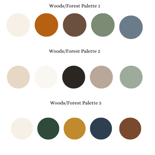
Woods/Forest
Best tones
Cream, oatmeal, soft white
Rust, clay, muted mustard
Olive, sage, deep green
Warm browns and denim
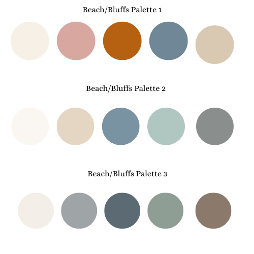
Beach/Bluffs
Best tones
Soft whites, cream, sand
Faded blue, slate, blue gray
Muted sage, seafoam
Soft blush or dusty rose
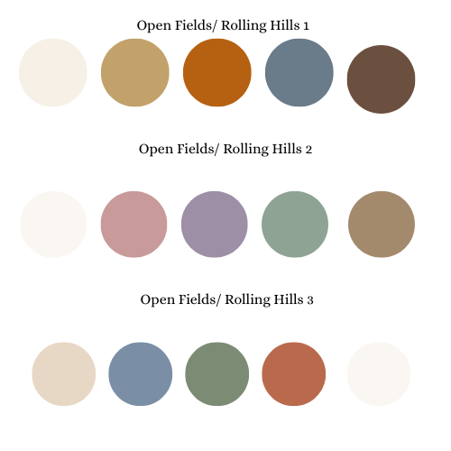
Open Fields / Rolling Hills
Styling for Indoor Sessions
In-home sessions tend to feel quieter and more intimate, so I recommend leaning into comfort and texture rather than anything overly styled. Cozy knits, soft cottons, linen, denim, and layers photograph beautifully indoors and help everything feel relaxed and natural.
Neutral and earthy tones often work especially well in home settings, but just like with outdoor sessions, what matters most is that your clothing feels true to how you actually live in your space. Bare feet, slightly oversized sweaters, and well-loved pieces are more than welcome here.
Think less “perfectly put together,” and more warm, lived-in, and real.
4. Final Tips
Layers photograph beautifully
They add movement, depth, and flexibility.
Footwear matters more than you think
Barefoot, boots, or neutral shoes tend to photograph best. Alot of my outdoor locations require walking on trails and rough terrain, plus my style usually leads to quite a bit of movement and play, so you want to make sure that you’re feet are comfortable and your’e not limiting your mobility.
Avoid logos & graphics when possible
They can date images quickly — unless they’re meaningful.
And always — if you’re unsure:
You are welcome to send me photos of outfits. I’m genuinely happy to help you put everything together.
Best tones
Warm neutrals (cream, tan, camel)
Rust, terracotta, soft mustard
Muted blues and warm denim
Subtle florals or patterns